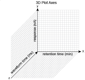
The 3D Amperometry Window
![]() Display Areas
Display Areas
The 3D Amperometry window displays three plots of the 3D_Amp data:
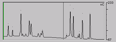
Chromatogram Plot
The chromatogram plot is generated either by retrieving one raw data point per Waveform from the selected 3D data (if raw data is displayed) or by calculating one integrated data point per waveform cycle from the selected 3D data (if integrated data is displayed). The x-axis is the retention time (min) and the y-axis is the response (nA for raw data or nC for integrated data).
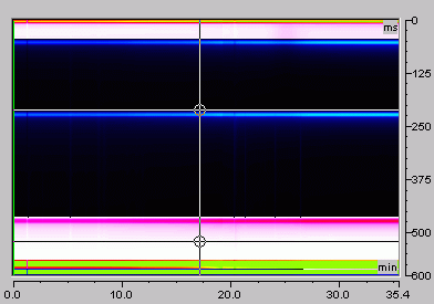
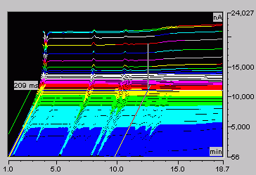
Raw 3D Data Plot
The raw 3D amperometry data plot can be viewed as either an isoamperometric or a 3D (wire frame) plot. For both plot types, colors are used to represent the ranges of response values.
The isoamperometric view is the default view for the 3D raw data. This is a top-down view of the data (imagine you are looking down on the data from above the plot). The x-axis is the retention time (min) and the y-axis is the Waveform Period (ms). The z-axis, which is not visible on the plot, is the response (nA). Different levels of response are represented by different colors.
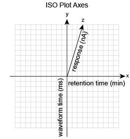
The 3D view projects the response values in the third-dimension, which allows you to see the height of responses and well as the color mappings. For this view, imagine you are standing in front and slightly to the left of the plot.
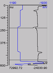
I-t Plot
The I-t plot is a plot of current (I) vs. waveform time (t). To better visualize this plot, imagine that a vertical slice of the 3D amperometry data is taken at retention time (T) and then the slice is laid flat. The left axis is the waveform period (ms) and the bottom axis is the current (nA). A waveform can optionally be overlaid on the plot. When the waveform is displayed, the top axis indicates the applied voltage (mV).
Also, refer to:
![]() Data Selection
Data Selection
![]() Analyzing 3D Amperometry Data
Analyzing 3D Amperometry Data